
Appalled by a nursing home’s treatment of her elderly father, Rhonda Harper started Penrose Senior Care Auditors to check up on seniors and make sure they’re being taken care of. Rhonda and her auditors inspect senior’s homes and apartments/rooms with a 150-point checklist covering cleanliness, supply levels and more.

I had previously worked with Rhonda to complete her brand identity for Penrose, but had always hinted that the logo itself needed to change. One glorious day, she emailed me out of the blue and told me to pull the trigger on the rebrand. I sprang for Gill Sans, the “British Helvetica,” as I was using it heavily to complement the thin Garamond of the logo. Replacing Garamond with Gill Sans really modernized the whole brand in a big way. No longer did Penrose look vaguely like a nursing home itself, but rather a 21st century defender of elder’s rights: technologically savvy as well as compassionate.

Of course no client actually calls you out of the blue, every design project has a problem that prompted it. In this case, Rhonda had entered the AARP Health Innovation@50+ LivePitch competition, made it to the final round, and saw the trends of the bigger industry around Penrose: senior care technology. She had re-positioned the brand as more focused on the check-in app, and so we needed to visually reposition the brand a bit. We both knew it was best to keep the rose intact and work in the new font around it. After a little back-and-forth discussion of the thickness of the font and overlap of the text, we settled on Gill Sans Bold.
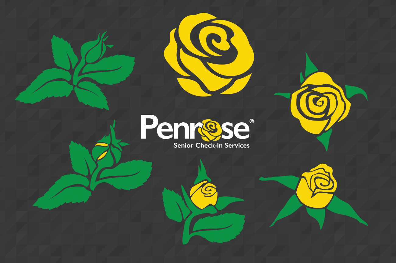
I then filled out the rest of the brand, including Auditor badges, logo color variations, new branding guide, and new illustrations of the Penrose rose blooming, for use in presentations.

Looking back, I’m satisfied with my work before the rebrand, I did what I could with what I had and I added a lot of substance to the brand. But I like the work after the rebrand even more. I feel like the Penrose brand reached its potential with the rebrand. It speaks to a more modern company, but it also has a friendly disposition. I think I struck a nice balance here and it’s some of my best work.